Charting Desk User Guide
A calm, plain-English walk through everything the app does, from your first chart to a full analysis workflow.
Welcome
Charting Desk is a tool for reading higher-timeframe markets (one hour and up). It is built for analysis and planning, not for high-speed trading, and it deliberately keeps things simple.
Charting Desk brings together the tools that usually live across several apps: a fast, higher-timeframe chart, a market scanner, automatic levels and structure, trade planning, comparison tools and a built-in beginner course. It runs entirely in your browser at chartingdesk.com, with nothing to install.
The web edition covers crypto plus equities in a limited capacity: US stocks, ETFs and forex. Indices, commodities and international equities are not included.
Everything below is written for a complete beginner. You do not need to know any trading jargon; the glossary explains every term the first time it appears. If a word looks technical, hover the matching control in the app and a plain-English hint appears.
Back to topHighlights
These are the parts users reach for most. Each card opens the full section later in the guide.
One click, whole market
The live Markets heatmap shows which coins, sectors and instruments are moving, sized by traded value and coloured by change.
A scanner for the whole market
The Scan tab runs 16 explainable recipes over your cached daily bars and returns shortlists with evidence chips, an invalidation level and a direction.
Levels drawn for you
Auto levels and auto structure mark prior day, week, month and year extremes, all-time highs and lows, round numbers, naked POC, support and resistance zones, trendlines, channels and breaks of structure.
Ideas with the reasoning shown
Trading ideas analyse the chart with seven detectors, then present entry, stop, target, R:R and the evidence for and against, so you judge rather than guess.
Compare anything
Overlay a second symbol as relative strength, time-warp a past window as a historical analogue, and study up to four linked panes at once.
A course built in
Learn mode teaches chart literacy through price action, Fibonacci, volume, momentum and execution, with worked examples, interactive exercises and graded quizzes.
53 studies, plus your own
A deep indicator library across every category, and a safe expression language for writing studies no built-in covers.
Plan the trade, not just the idea
The long and short tools set entry, stop and multiple targets as R multiples, while alerts watch your levels for you.
60-second tour
Let us get a chart on screen before we explain anything.
- Go to chartingdesk.com. It opens on BTC/USDT daily with a starter setup already in place.
Once a chart is up:
- Pan by dragging the chart, zoom with the mouse wheel over the chart.
- Click any timeframe button in the toolbar (for example 4h or 1W) to change the bar size.
- Hover the chart: the top-left legend shows that bar's open, high, low, close, change and volume.
- Click the toolbar Indicators button and add RSI if it is not already there.
- Hover a button you do not understand. A hint appears. That is the whole learning model.
The screen at a glance
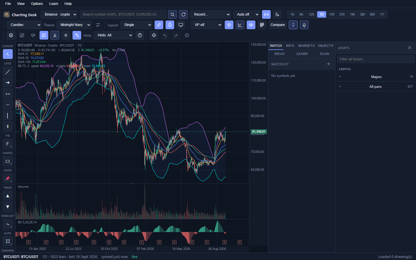
The window has five zones. Knowing their names makes the rest of the guide easy to follow.
1. Menu bar
Words along the very top: File, View, Options, Learn, Help. These mirror the toolbar. Full list in the menu map.
2. Toolbar
The icon buttons under the menu, grouped left to right: Symbol and data, Timeframe, Chart display, Panes, Analysis, Layout and export, View and replay.
3. Tool rail
The narrow column of drawing tools on the left, stacked by category: Cursor, Lines, Fib, Shapes, Icons, Trade, Forecast, Auto, Compare and Tools.
4. The chart
Up to four independent panes. Each has a legend, price axis, time axis and a volume or indicator area underneath.
5. Right sidebar
Tabs: Watch, Info, Markets, Objects, Ideas, Learn and Scan. The Assets drawer can also slide in from the right.
Status bar
The thin strip at the bottom: current symbol, bar count, sync and live status, the hovered bar, and short messages.
Simple and Advanced
The toolbar has two personalities. Simple hides the specialised controls so beginners are not overwhelmed. Advanced reveals them. Toggle between the two with the sparkles button at the right of the toolbar.
The browser edition
Charting Desk runs in the browser at chartingdesk.com. There is nothing to install and no account: open the page and start charting. Your charts and settings are stored in your own browser.
| Area | Status |
|---|---|
| Crypto (Binance) | Yes |
| Stocks, ETFs, forex (US) | Yes, limited |
| Indices, commodities, international equities | Desktop edition only |
| Markets heatmap | Yes (crypto board) |
| News, earnings, economic calendar | Limited |
| Learn mode | Yes |
| Where your data lives | In your browser (IndexedDB) |
How your chart gets its data
You do not connect anything, log in, or paste an API key. Charting Desk talks to public, keyless data sources and quietly caches what it downloads.
Where prices come from
- Crypto: Binance, the exchange. Crypto charts can also update in real time (see Live below).
- Stocks, ETFs and forex: a cached Yahoo feed with a free intraday source, in limited capacity (US symbols).
Sync, cache and the stale flag
- Cache: downloaded bars are stored so a chart reopens instantly and works offline.
- Sync: the circular-arrow Sync button fetches the latest bars for the active chart.
- Stale: if data is old, a small note in the status bar says so. Sync when you want fresh prices.
- Auto-refresh: the Auto-refresh dropdown (Off, 15s, 30s, 1m, and up to 1h) reloads the active chart on a timer.
- Daily cache for the scanner: the Scan tab works from the daily bars already cached on your device. Open or sync the symbols you care about to fill the cache.
Live streaming
For crypto, the Live button streams updates over a websocket so the newest bar ticks in real time. The status chip shows live, connecting or reconnecting. Live works on the 1h, 4h, 12h, 1D, 1W and 1M timeframes. The slowest timeframes (2W and longer) simply refresh on a timer.
Live needs outbound access to Binance. In some networks or regions it is blocked, in which case the chip shows reconnecting and the chart falls back to normal syncing. You are never stuck.
Back to topTimeframes
The timeframe is the amount of time each bar (candle) covers. It is the single most important choice, because it changes what every indicator and every pattern means.
| Button | One bar is | Good for |
|---|---|---|
| 1h | one hour | Intraday structure, refined entries. |
| 4h | four hours | A popular middle ground for swing analysis. |
| 12h | half a day | Slower swings (uses a 12h UTC bucket). |
| 1D | one day | The default for most analysis. |
| 1W | one week | The bigger trend. |
| 2W | two weeks | Very long trend context. |
| 1M, 3M, 6M, 1Y | calendar months and years | Long-term investing views. |
Under the hood the app stores two native resolutions (1 hour and 1 day) and builds every larger timeframe from them. Timeframes are bucketed in UTC, so a "day" starts at midnight UTC.
h is hours,
d days, w weeks; uppercase M is months and Y years.Chart types
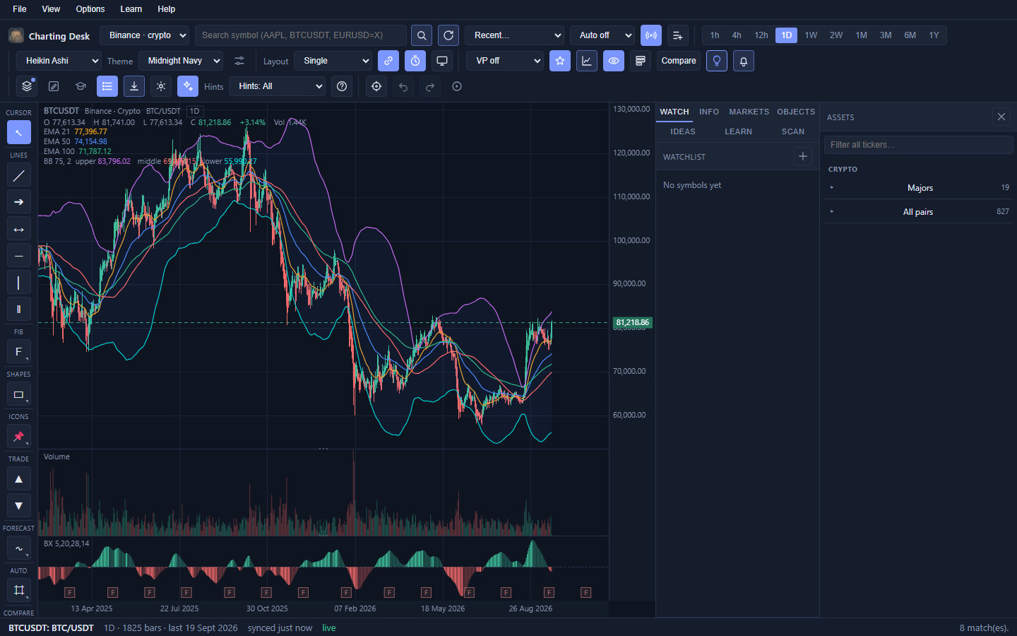
The Chart type dropdown in the toolbar changes how price is drawn. All twelve draw from the same underlying data, so your drawings and indicators are unaffected when you switch.
| Chart type | What it shows |
|---|---|
| Candles | The standard. Body from open to close, wicks to the high and low. |
| Hollow candles | Candles with hollow bodies, often easier to read in clusters. |
| Bars | Classic OHLC bars. Very little ink. |
| Line | Only the close, joined up. The cleanest view of trend. |
| Area | A line with a filled area underneath. |
| Baseline | Split colouring above and below a reference price. |
| Heikin-Ashi | Averaged candles that smooth noise. Prices are synthetic, so use it for trend only. |
| Renko | Bricks of a fixed price size, ignoring time. |
| Range | Bars of a fixed price range. |
| Kagi | Reversal-driven line that thickens with the trend. |
| Line Break | Three-line-break style columns. |
| Point & Figure | X and O columns driven by price movement only. |
Scales and overlays
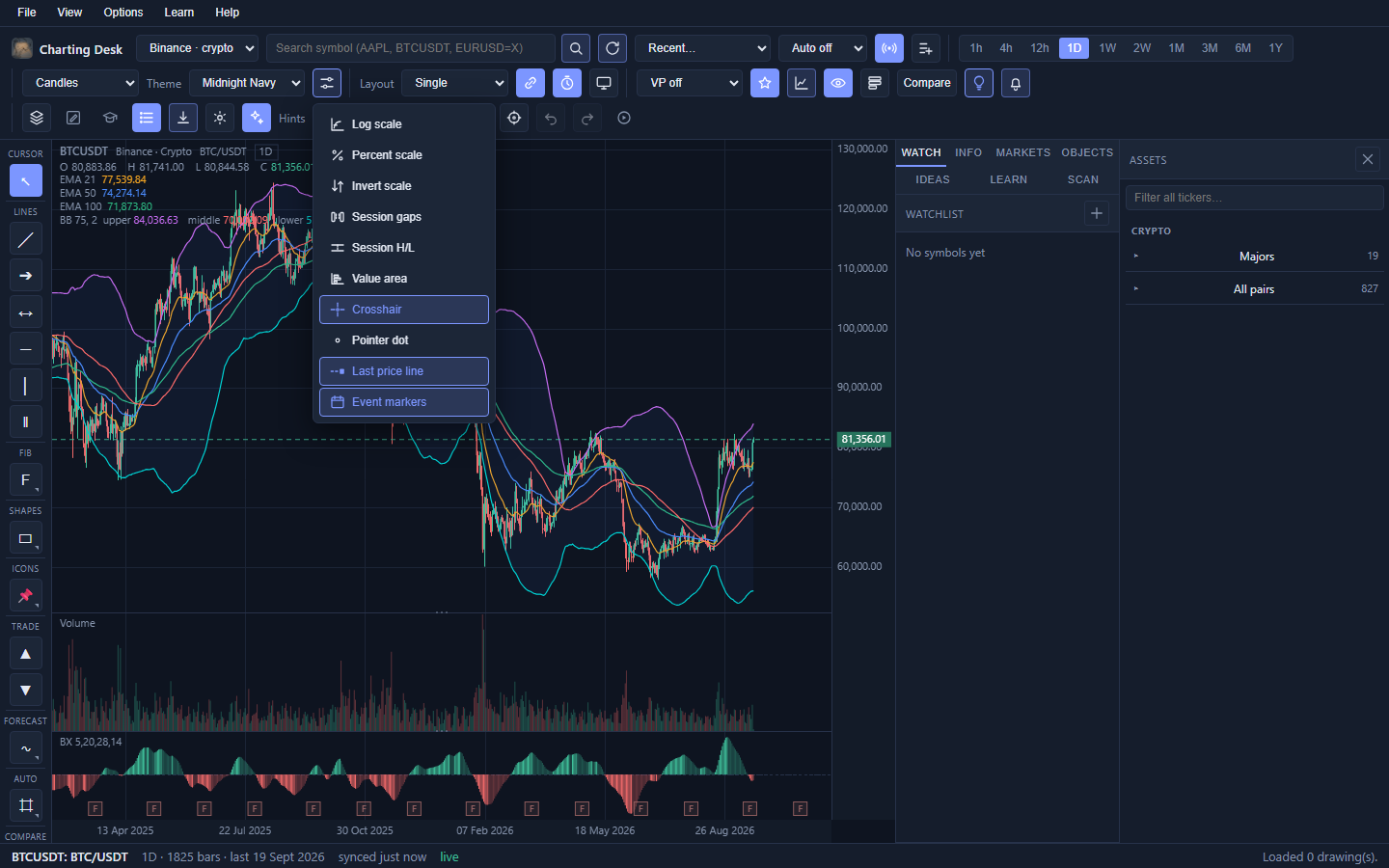
These controls decide how the price axis and the chart furniture behave. In the toolbar they live inside the Display button (the small panel icon).
| Control | What it does | When to use it |
|---|---|---|
| Log scale | Spaces the axis in percentages, not dollars. | Long histories and big assets, so a move from $10 to $100 looks the same size as $100 to $1000. |
| Percent scale | Shows the axis as change from the first visible bar. | Comparing very different price levels. |
| Invert scale | Flips the axis upside down. | Looking at a chart from the short side, or studying weakness. |
| Session gaps | Marks overnight and weekend gaps. | Equities, to see where the session stopped. |
| Session H/L | Draws the last session's high and low lines. | Quick support and resistance for the current session. |
| Value area | Shades the 70% volume area when a volume profile is on. | Finding the prices where most trade happened. |
| Crosshair | Dashed lines that follow the pointer. | Reading exact price and time. |
| Pointer dot | A dot at the cursor. | Extra precision when placing drawings. |
| Last price line | A horizontal line at the latest close. | Always knowing where price is right now. |
| Event markers | Letters along the bottom for dividends, splits, earnings and FOMC days. | To keep dated events in view; FOMC dates are always available. |
Search and the omnibox
The search box is the front door. Type a ticker or a company name and press Enter (or click the magnifier).
- One search, all sources. The box searches every source the edition offers, including crypto and, on the web, US stocks, ETFs and forex.
- Grouped results. Matches are grouped by asset class: Crypto, Stocks, ETFs, Indices, Forex, Metals and so on.
- Source badge. Each row shows where the data will come from.
- Pinned first. Symbols already on your watchlist or recently viewed float to the top.
- Smart ranking. An exact ticker beats a prefix, which beats a partial name.
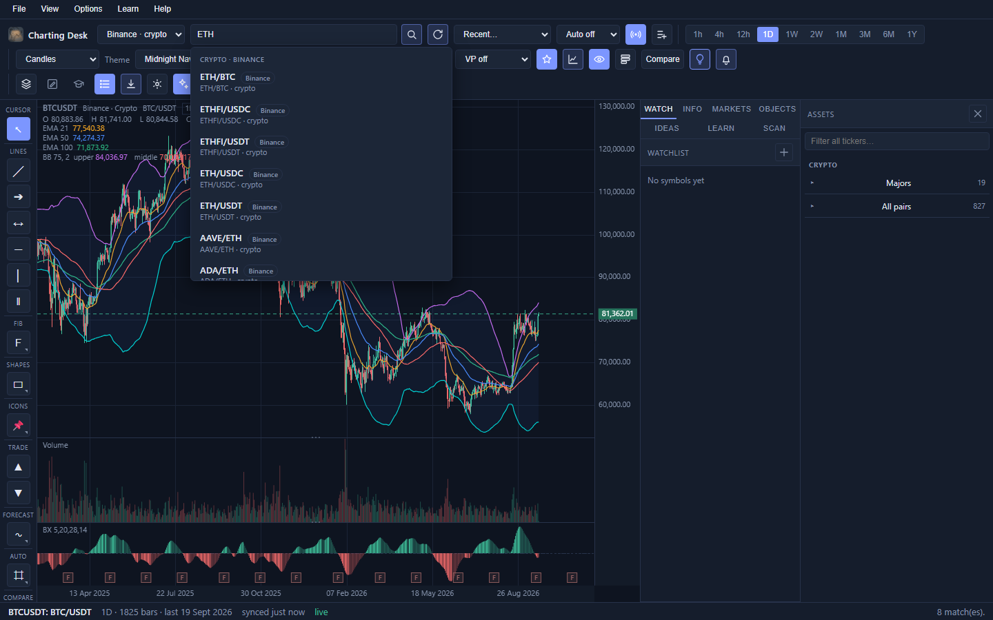
Click a row to load it. Press Esc to close the list. Examples to try:
AAPL, BTCUSDT, EURUSD=X.
The Assets drawer
The Assets button slides a browsing panel in from the right, with a two-level tree: a Popular list, then sections such as Crypto, Stocks, ETFs, Indices, Forex and Commodities, each with groups inside. The S&P 500 and NASDAQ-100 groups list their full membership.
- Type in the filter box to narrow the tree as you go.
- Groups fill in only when you open them, so the drawer stays quick.
- Click any ticker to load it on the active chart.
- Open it from the toolbar Assets button, the View menu, or Ctrl+Shift+A.
In the browser edition the equity sections list US stocks, ETFs and forex in limited capacity; indices and commodities are desktop only.
Back to topWatchlist
The Watch tab in the right sidebar is a simple, ordered list of the symbols you care about.
- Add: with a chart open, click the + beside the Watchlist header, or the toolbar star, or Options → Add to watchlist.
- Load: click a symbol in the list.
- Remove: click the × on the row.
- The active symbol is highlighted so you always know what you are looking at.
The watchlist is also a universe for the Scan tab.
Back to topMarkets heatmap
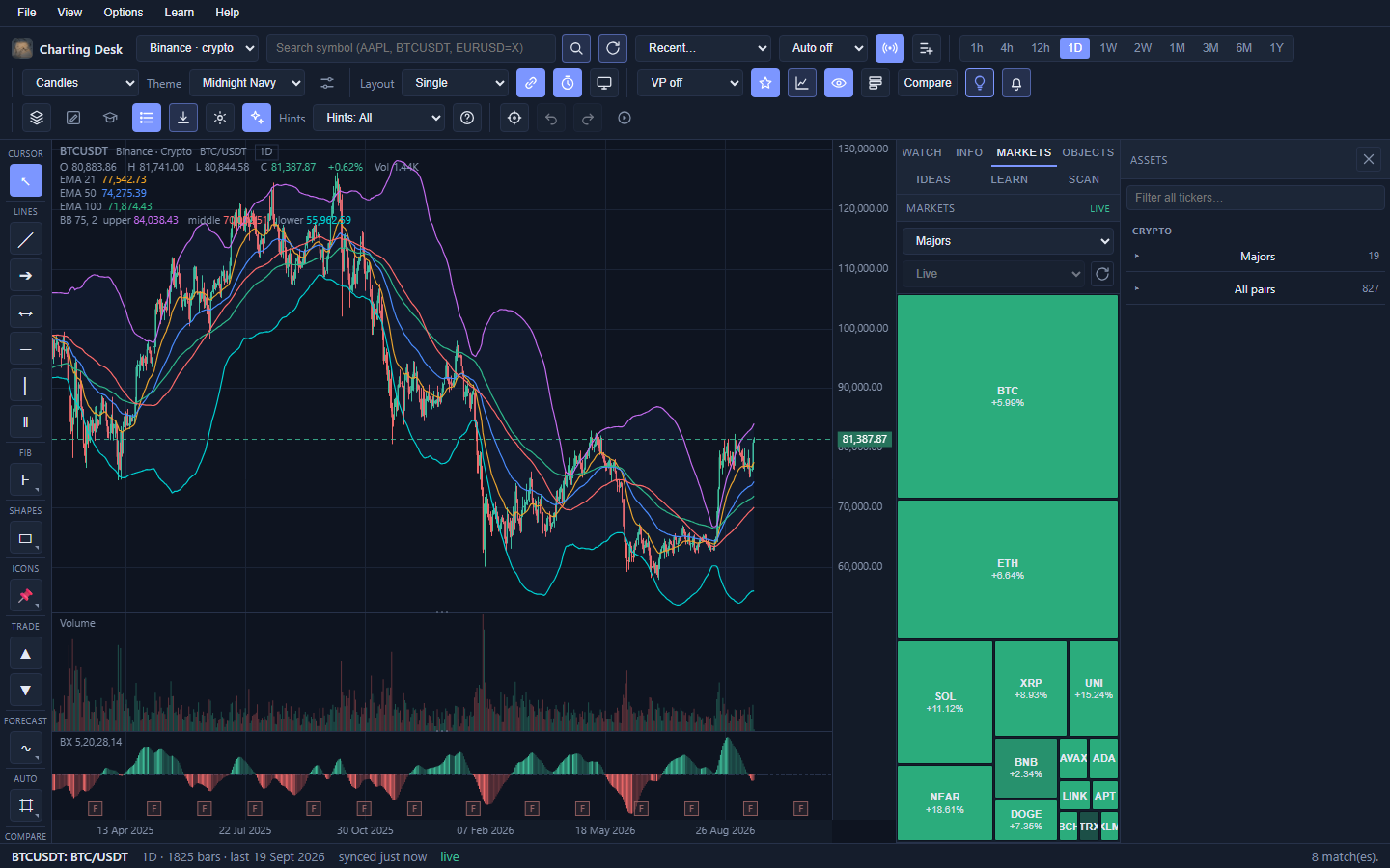
The Markets tab gives you a bird's-eye view of a whole group at once. Each tile is a symbol; the size of the tile is how much it traded and the colour is how much it moved. Green is up, red is down, deeper shades mean bigger moves.
- Universe chooses the board: a live Crypto board. Equity, sector, commodity and forex boards are desktop only.
- Period is Live, 1h, 1D or 1M (Live is crypto only; the rest use cached bars).
- Click any tile to load its chart.
- The refresh button re-pulls quotes. Boards update on their own roughly every five minutes while open.
Info tab: news, earnings and calendar
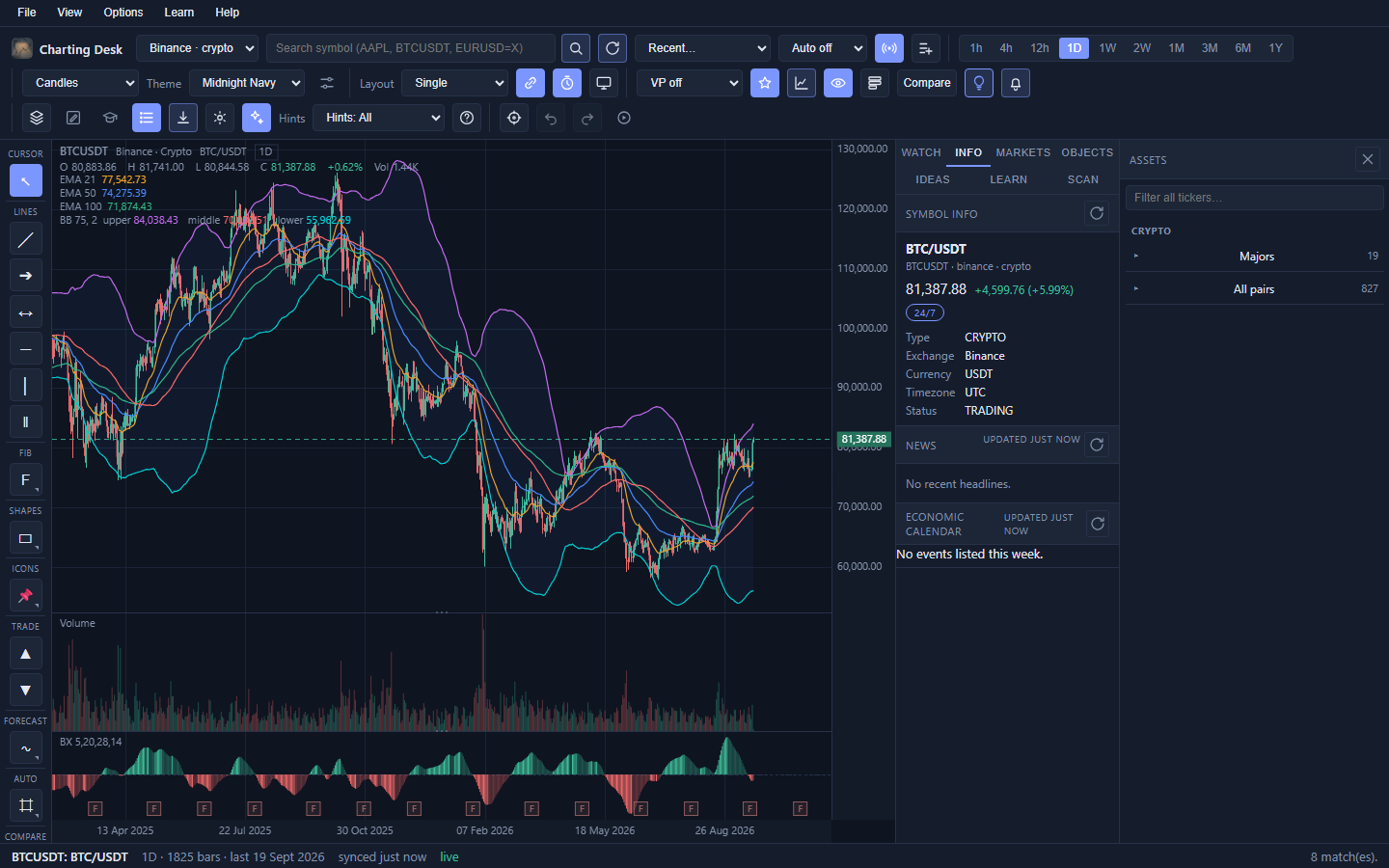
The Info tab answers the "what is this thing and what is going on around it?" questions. It refreshes when you change symbol and again about once a minute while it is open. Everything here is cache-first, so it stays instant after the first load.
| Panel | What it shows |
|---|---|
| Symbol info | Exchange, currency, timezone, instrument type, status, session state (Pre, Open, After, Closed, or 24-7), last price and change. |
| News | Headlines for equities, plus a ranked crypto news feed for coins. |
| Economic calendar | The week's scheduled economic events, so you know when volatility is due. |
The legend and status bar
Two quiet but important readouts.
The chart legend (top-left)
Shows the ticker, provider, asset class and timeframe. Below that it lists the hovered bar's O H L C, change percent and volume. If you are not hovering, it shows the latest bar instead.
The status bar (bottom)
Shows the active symbol and name, how many bars are loaded, sync and live state, the hovered bar details, and short messages such as a toast or a data warning.
Multiple panes
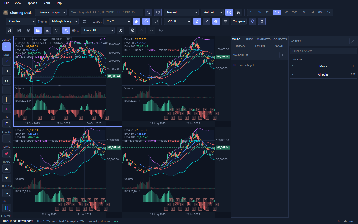
You can show up to four independent charts at once. The Layout dropdown offers Single, Two columns, Two rows and a 2 x 2 grid. Click any pane to make it active; the toolbar, rail and sidebar then apply to that pane.
- Link symbols keeps every pane on the same symbol as you change it.
- Link timeframes keeps every pane on the same timeframe.
- Turn both off to compare up to four different markets at once.
- Hover a pane in a multi-pane layout for a maximize button. It enlarges that pane temporarily without changing your saved layout.
Bar Replay
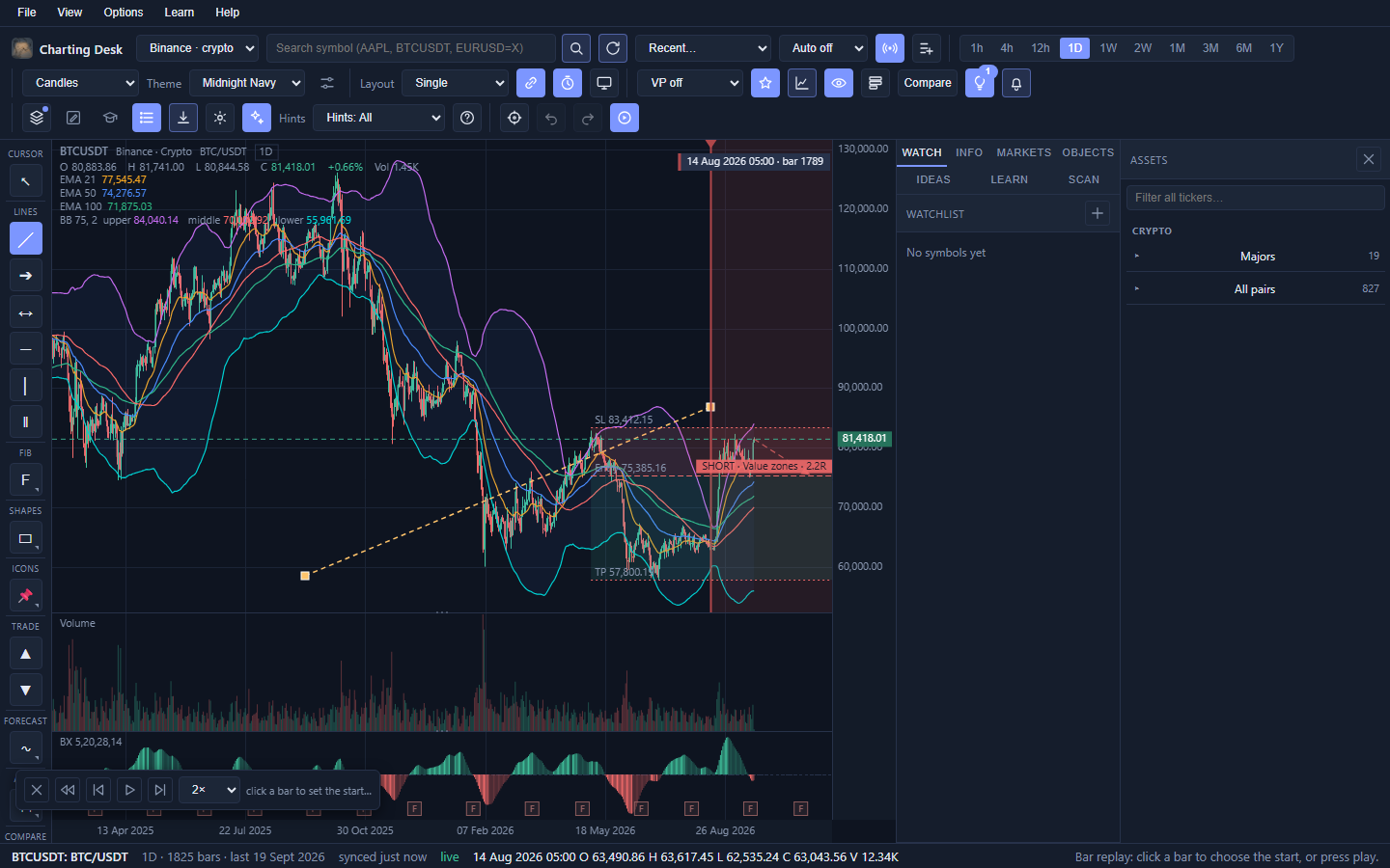
Bar Replay hides the future so you can practise decision-making on historical bars. It is the single most useful learning feature in the app.
- Click Replay in the toolbar (View and replay group).
- The full chart appears and asks you to click a bar to choose where to start.
- Use play, step forward, step back, and the speed dropdown (1x, 2x, 4x, Fast).
- Draw, add indicators, and watch alerts evaluate as if it were live.
- Press the rewind button (↺) to re-pick a start bar, or the close button to exit.
Blackboard
The toolbar Board button replaces the chart with a blank, gridless canvas and the full drawing toolkit. Use it to sketch an idea, map a strategy, or explain a concept without a symbol in the way.
- Board drawings are saved separately from any symbol, so turning the board off never disturbs your charts.
- Everything in the tool rail works here: lines, shapes, arrows, doodles, text and stickers.
- Toggle Board again to return to your chart.
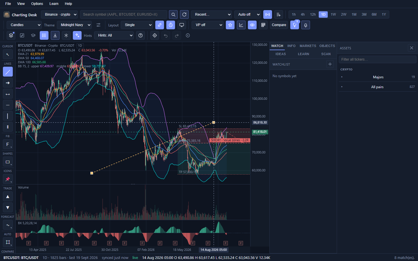
The drawing tools
The rail on the left holds every drawing tool, grouped by purpose. Tools that belong together (Fib, Shapes, Icons, Forecast, Auto, Compare) open a small panel beside the rail when clicked, so the rail never becomes a wall.
| Group | Tools |
|---|---|
| Cursor | Select and pan. |
| Lines | Trend line, ray, extended line, horizontal level, vertical line, parallel channel. |
| Fib | Fibonacci retracement, extension and fan (details below). |
| Shapes | Rectangle, ellipse, arrow, zig-zag arrow, doodle, text, marker. |
| Icons | Annotation stickers: pointers, pins and glyphs to tag a spot on the chart. |
| Trade | Long and short position planning tools (details below). |
| Forecast | Auto Fibonacci, auto trend line, Andrews pitchfork, and projection figures. |
| Auto | Automatic reference levels and auto structure (details below). |
| Compare | Compare overlay, historical analogue, earnings overlay, and a clear-all action. |
| Tools | Measure, eraser, magnet and delete. |
Drawing in three steps
- Pick a tool. Most are two-point tools; the cursor changes to a crosshair.
- Click once for the first point, move, then click again for the second. Fibonacci extension and some figures use three points.
- To reshape it, switch to Select, click the drawing and drag its handles.
Fibonacci tools
Fibonacci tools measure a move and mark where price might pause.
- Retracement (F): two points. Marks the pullback levels between them, with optional shaded "golden zone" bands.
- Extension (X): three points. Projects targets beyond the move (the classic uses are 1.272 and 1.618).
- Fan (G): two points. Radiates levels diagonally as dynamic support and resistance.
- Auto Fibonacci (in Forecast): finds the visible swing for you and draws the retracement in one click.
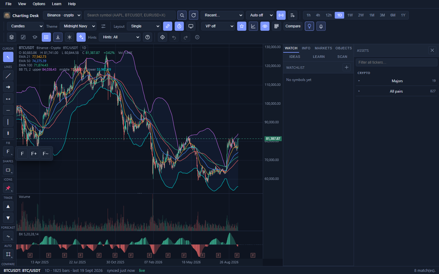
Double-click a Fibonacci drawing to open its settings. There you can edit all 24 levels by hand, give each its own colour, show or hide individual levels, and tick Reverse to swap which end is 0%. The defaults show 0, 0.618, 0.786, 0.826 and 1.
Auto levels and auto structure
The Auto fly-out is a one-stop shelf of reference levels the computer can find for you. Each row is an independent on/off toggle and each carries a colour swatch. Nothing is on until you ask.
| Section | Rows |
|---|---|
| Periods | Prior day, week, month and year highs and lows (PDH/PDL, PWH/PWL, PMH/PML, PYH/PYL). |
| Extremes | All-time high and low (ATH/ATL). |
| Price | Round numbers, the levels people tend to cluster orders around. |
| Volume | Naked POC, an untested high-volume price from a previous session. |
| Structure | Support and resistance zones, trend lines, a parallel channel, and structure breaks (BOS and CHoCH). |
| Patterns | Converging rails, a range box, and a measured move target. |
| Liquidity | Unfilled gaps and equal highs or lows. |
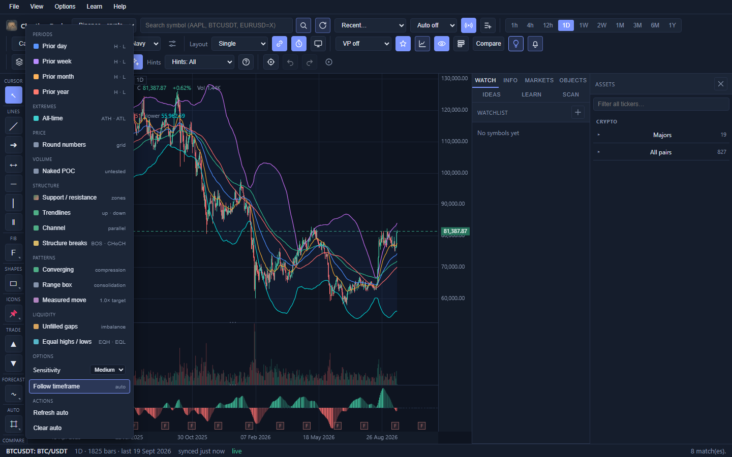
- The Sensitivity dropdown (Low, Medium, High) tunes how eager the structure detectors are. Medium is the default.
- Follow timeframe keeps the automatic drawings matched to the timeframe you are viewing. When it is off and the drawings came from another timeframe, a small warning chip says so.
- Refresh auto and Clear auto affect only machine-made drawings. Your own drawings are never touched.
Planning a trade
The Long and Short tools turn a chart idea into a plan with explicit risk. They are about discipline, not prediction.
- Pick Long (S) or Short (Shift+S).
- Click your entry price.
- Click your stop price. The risk band appears immediately.
- Drag the take-profit line to set the target. By default there is one target at 2R (twice your risk).
- Double-click the position to open its settings, where you can add up to TP1 to TP4 as R multiples and set the percent you would close at each.
The tool shows a blended expected R and a live readout as you adjust it. Drag a take-profit line directly on the chart to change its R multiple.
Projection figures
Projection figures are ready-made price-path shapes (about 29 of them) that you drop onto the chart as translucent "ghost" candles. They are for asking "if price follows this kind of path, where does it end up?"
- Open Projection figures from the rail Forecast group (or Options → Projection figures).
- Pick a figure from the list.
- Click two opposite corners on the chart to place it.
- Drag any point to reshape it and fit it to your levels. Drag it into the future to project forward.
A Render option lets you choose "match chart style" or force a simple line. Figures follow your chart type by default.
Back to topEditing, templates and the Objects panel
Selecting and editing
- Select (V) then click a drawing to select it. Handles appear at its anchor points.
- Drag a handle to reshape; drag the body to move the whole drawing.
- Marquee: Shift+drag to select several drawings at once.
- Copy, paste, duplicate: Ctrl+C, Ctrl+V, Ctrl+D. Select all with Ctrl+A.
- Delete: Del or Backspace. The Eraser (Q) deletes by dragging over drawings, and one drag is one undo step.
- Undo and redo: Ctrl+Z and Ctrl+Shift+Z (or Ctrl+Y).
- Lock or hide any drawing so you can keep working around it.
The per-drawing settings dialog
Double-click any drawing (or right-click it, or use the pencil in the Objects list) to open a full settings window: name, visibility, lock, colour, width, line style, opacity, text and font, editable anchor coordinates, and templates. OK and Cancel sit in a pinned footer, and one session counts as a single undo step.
Templates
A Template is a saved look for a drawing: colour, width, text and Fibonacci levels. Select a drawing, pick a built-in template (Support, Resistance and others) from the toolbar Template dropdown, or choose Save current as template to create your own.
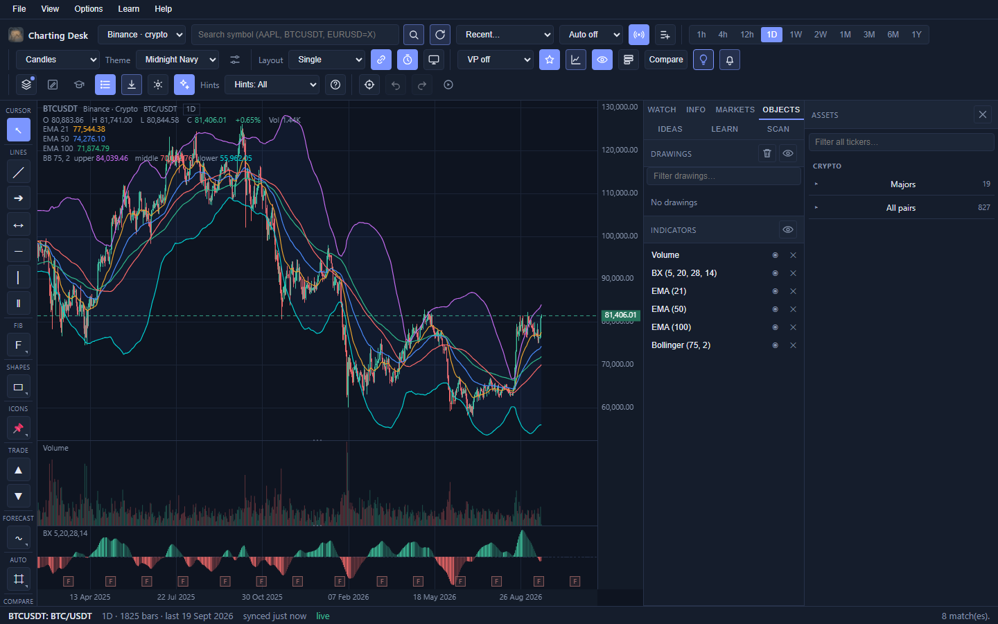
The Objects panel
The sidebar Objects tab lists everything you have added, and is the fastest way to manage a busy chart.
- Drawings: filter, rename, reorder by dragging, show or hide, lock, edit, delete, clear all, or hide all.
- Indicators: show or hide each study, or remove it. Hidden studies stay computed so indicator alerts keep working.
Adding indicators
Indicators (also called studies) are calculations drawn from price. Charting Desk ships 53 built-ins, organised by category so you can find what you need.
| Category | Examples |
|---|---|
| Moving averages | SMA, EMA, WMA, HMA, DEMA, TEMA, VWMA, VWAP, anchored VWAP. |
| Bands and channels | Bollinger Bands, Keltner, Donchian, Chandelier, %B, VWAP bands, Value Zones. |
| Momentum | RSI, MACD, Stochastic, CCI, Williams %R, ROC, Momentum, TRIX, PPO, and more. |
| Trend | ADX, Supertrend, Aroon, Vortex, PSAR, linear regression, Ichimoku. |
| Volatility | ATR, standard deviation, Choppiness. |
| Volume | Volume, Volume MA, OBV, MFI, Chaikin Money Flow, Force, EOM, VPT, Accumulation/Distribution. |
To add one
- Click the toolbar Indicators button.
- In Add an indicator, choose from the dropdown. A one-line description appears underneath.
- Adjust any parameters (period, colours, levels) that appear beside the picker.
- Click Add. It appears in the On the chart list and on the chart.
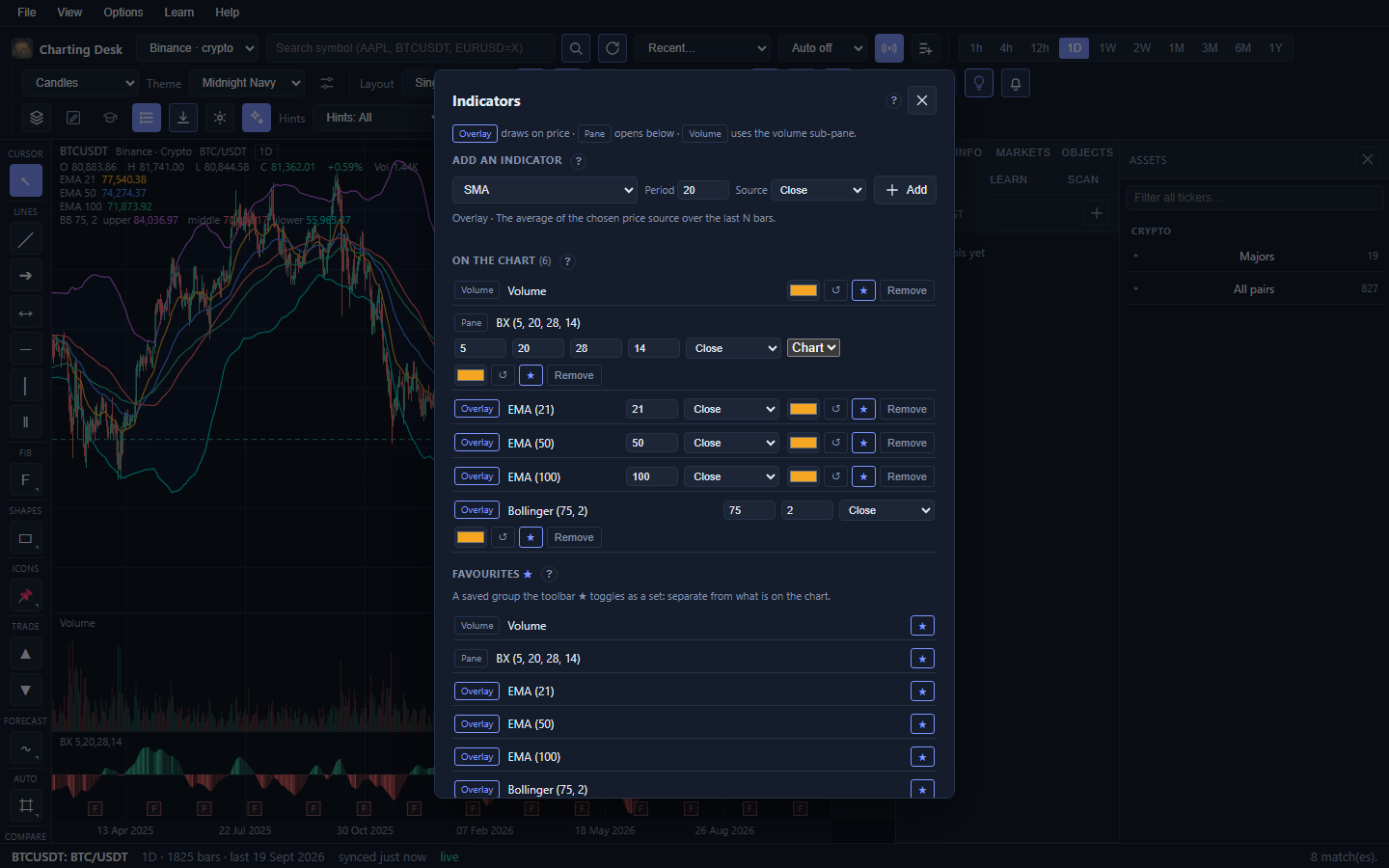
Each study shows a placement chip: Overlay on the price chart, Pane in its own panel below, or Volume in the volume pane. The order in the On the chart list is the draw order.
The Favourites section is a saved set you can toggle on and off as a group with the toolbar star button. First run seeds a sensible bundle (Volume, BX, EMA 21/50/100 and Bollinger Bands).
Back to topVolume profile and Value Zones
Volume profile
A volume profile is a sideways histogram showing how much trade happened at each price, rather than at each time. The toolbar dropdown offers four modes:
- Off.
- Visible: profiles the bars currently on screen.
- Session: one profile per session.
- Anchored: profiles from a bar you pick. Click Anchor in the toolbar, then click a bar.
The POC (point of control) is the price with the most volume, and it often acts like a magnet. Switch on Value area in the Display menu to shade the 70% zone (VAH and VAL).
Value Zones
Value Zones read the trend's structure, measure its last impulse leg, and shade where a pullback would be attractive. In an uptrend it marks a Value Buy and Discount Buy zone, with TP and SL lines at the leg extremes. In a downtrend it marks the mirror-image Premium Sell and Peak Sell zones. If the structure is mixed, it draws nothing, which is itself useful information.
Chart presets
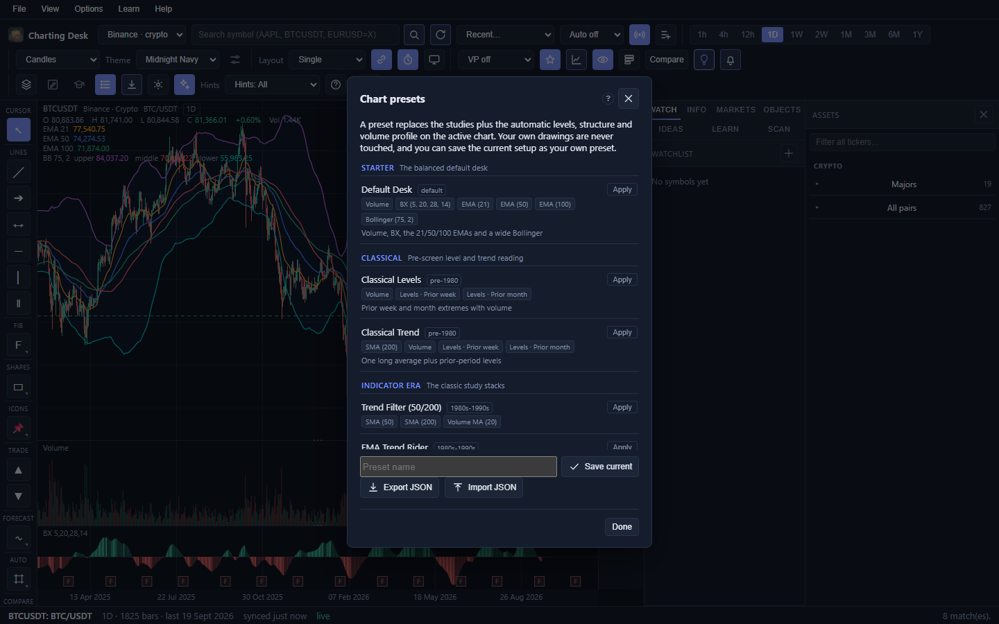
A preset applies an entire chart setup in one click: the studies plus the automatic levels, structure and volume profile, grouped by school of thought. Presets are the quickest way to try a style you have not used before. Click the toolbar Presets button for a quick menu grouped by school, or choose Manage presets… in that menu to open the full Chart presets dialog.
- Groups include Starter (the Default Desk), Classical, Indicator era, Market profile, Structure and Modern volume-price.
- Each preset has a one-line summary and a short why so you know what it is trying to show you.
- Applying a preset replaces the studies and automatic layers. Your own drawings are never touched.
- Save current as preset captures your setup under My presets, and presets can be exported and imported as JSON.
Custom indicators
If the 53 built-ins are not enough, you can write your own study in a small, safe expression language. There is no plugin system and no risk to your machine: the language can only do maths on price series.
- Open Indicators, then the Custom section, then New custom indicator.
- Give it a name. Hover hints explain the fields.
- Choose Overlay (on price), Pane (below the chart) or Volume.
- Optionally pick a Higher TF. The expression is then recomputed on locally resampled higher-timeframe bars.
- Type the expression and click Add to chart.
Inputs are open, high, low, close,
volume, hl2, hlc3 and ohlc4. Around 34 functions are
available, including sma, ema, wma, hma,
dema, tema, rma, stdev, rsi,
atr, highest, lowest, sum, cum,
shift, change, roc, abs, sqrt,
log, min, max, pow, clamp,
nz, cross and bar_index. Use plot(x, "Name", "#rrggbb",
"histogram") to style each line and fill(a, b, "#rrggbb") to shade a band.
Two special calls open the door to bigger ideas: study("rsi", 14) borrows a built-in
study's series, and htf(series, "1d") samples a series at a higher timeframe.
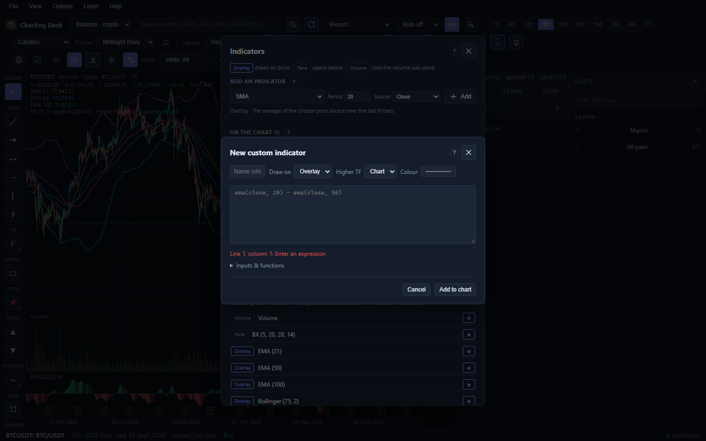
Scripts are saved in a library, and the whole library can be exported and imported as JSON. Custom studies render exactly like built-ins, so panes, the legend, alerts and workspaces all work with them.
ema(close, 20) - ema(close, 50). Plot it as a pane or a histogram and watch it cross zero.Compare and analogues
Compare overlay
Click the toolbar Compare button, search a second symbol, and it is overlaid on your chart
normalised to percent change from the left edge of the view. The legend reads something like
ETHUSDT +4.20%. This answers "is this instrument strong or weak against that one?" without
price levels getting in the way.
Historical analogues
The rail Compare group's H tool time-warps a past window of any symbol onto your chart. Pick a source, a date range and an optional bar count, set an anchor bar, then Add analogue. The source history is resampled and projected as a dashed line. With the select tool you can drag it forward in time, stretch it, or scale it.
Back to topEarnings overlay
The rail Compare group's E toggle draws reported quarterly EPS as slim blue bars on the price pane, scaled into the visible price range. Each bar is labelled with its EPS. It applies to instruments that report earnings (equities and ETFs), which are desktop only; crypto has none.
Quarterly history merges recent Nasdaq data with deep SEC filings, cached for twelve hours. The toggle is on by default and is remembered as a preference.
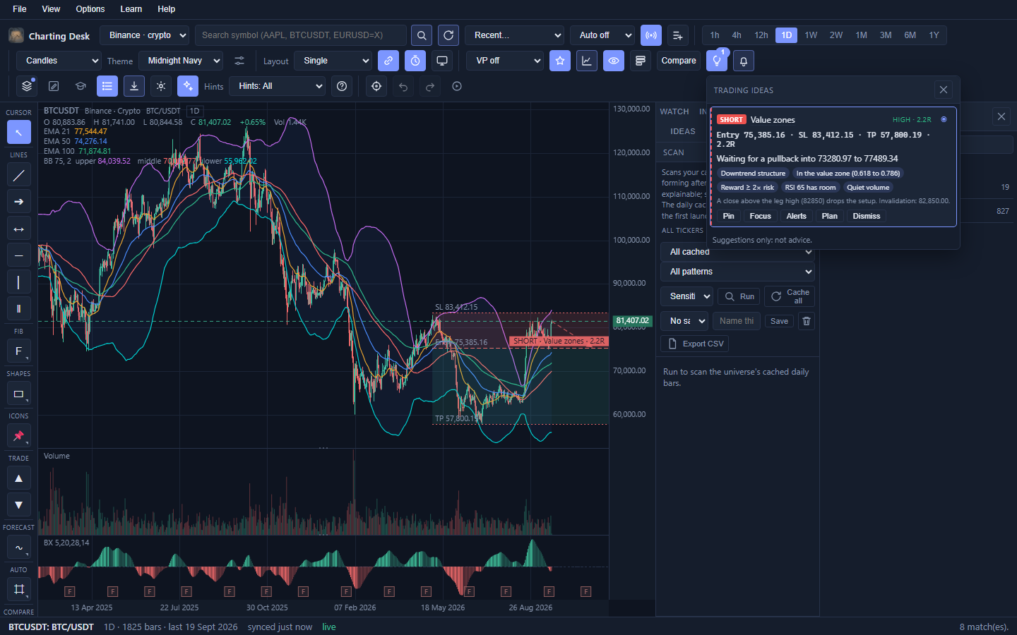
Trading ideas
The toolbar bulb asks the app to analyse the chart and mark its best setups. This is an automated second opinion, not a recommendation.
- An overlay draws an entry, a stop, a target, risk and reward shading, and a dashed projection when the setup is still waiting.
- A popover and the sidebar Ideas tab list up to six setups, strongest first, with the direction, the strategy name, entry, stop, target and R:R.
- Evidence chips show what supports and what argues against each idea.
- You can Focus, set Alerts, open the Plan, Pin it, or Dismiss it.
- Seven detectors ship: Value zones, Trend pullback, Range fade, Breakout and retest, RSI divergence, Volume climax, and MA cross. Each carries a higher-timeframe confluence note.
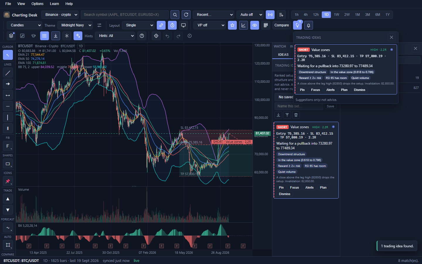
Pinned ideas persist per symbol, dismissals expire when the setup leaves the chart, and named sets can be saved and exported. Confidence is expressed as Low, Medium or High.
Alerts
Alerts watch a level and tell you when price reaches it, so you do not have to stare at the screen.
| Type | Watches |
|---|---|
| Price | A price level you type. |
| Indicator | A line from a study already on the chart, bound by its exact settings. |
| Drawing | The live level of a horizontal line, trend line, ray or extended line. It follows the drawing if you move it. |
- Click the toolbar bell to open Alerts.
- Choose the type, the condition (for example "crosses above"), and the level or line.
- Click Add. The toolbar bell shows how many alerts are armed.
There is a shortcut for drawings: open the Objects tab and click the bell on a drawing row to arm an alert on it in one click.
Scan
The sidebar Scan tab runs an explainable screen over your cached daily bars. It is a way to turn "show me candidates" into a short, reasoned list, rather than scrolling through hundreds of charts.
- Universe: All cached (default), Crypto, Assets (everything non-crypto), or your Watchlist.
- Pattern: All, Base, Breakout, Reversal, Momentum, Continuation or Volume.
- Recipes: 16 built-in screens, including base accumulation, fresh highs, gap ups, near 52-week highs, double bottom, double top, EMA and MACD crosses, thrust, moving-average alignment, relative strength, RSI divergence, pullback, flag, volume surge and volume climax.
- Results are grouped in collapsible sections per recipe, each row with additive evidence chips, an invalidation level and a direction. Click a row to load the chart.
- Sensitivity (Low, Medium, High) tunes every recipe at once.
- Saved scans keep a recipe and universe combination, and results can be exported as CSV.
The web scanner covers crypto only. It works from the daily bars already cached on your device, so load or sync the symbols you care about first.
Back to topLearn mode
Learn mode is a complete beginner's course built into the app, with worked examples drawn on real (synthetic) charts. It lives in its own world: entering it does not touch your saved charts, drawings or settings, and your practice sketches are discarded when you leave.
| Phase | Title | You learn |
|---|---|---|
| M0 | Chart literacy | Candles, timeframes, scales, chart types, the interface. |
| P1 | Price action | Risk and R multiples, candle mechanics, structure, trend lines, support and resistance. |
| P2 | Fibonacci and geometry | Impulse and correction, retracements, extensions, chart patterns, harmonics. |
| P3 | Volume, momentum, volatility | Volume dynamics, profile, moving averages, oscillators, divergence, volatility. |
| P4 | Institutional benchmarks | VWAP, anchored VWAP, deviation bands, session structure. |
| P5 | Synthesis and execution | Multi-timeframe alignment, confluence, position sizing, trade management, psychology. |
- Open it from the toolbar Learn button, the Learn menu, or the sidebar Learn tab.
- Each lesson loads an annotated example, shows the outcome, and offers prose, callouts and steps.
- There is an inline Reveal control, interactive exercises (pick on the chart, draw along) and a chapter quiz with an explanation for every answer.
- Every module closes with a graded exam (70% to pass).
- Your progress is stored locally and you can toggle it on or off.
Workspaces
A workspace is a saved snapshot of your whole view: symbol, timeframe, chart type, indicators, scale, drawings, compare, panes and more. It is how you return to a setup tomorrow without rebuilding it.
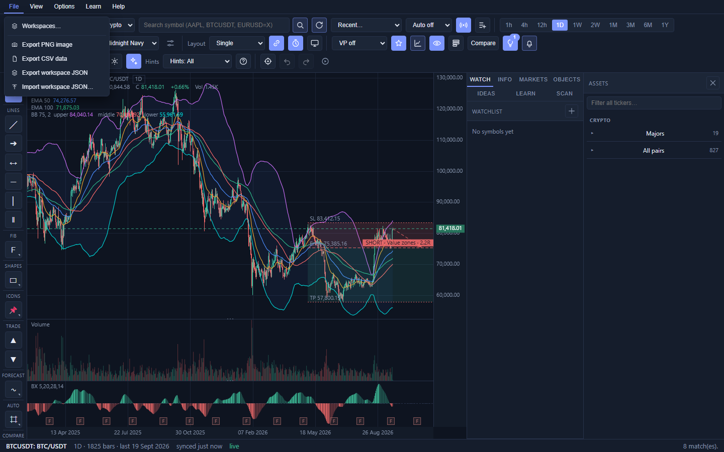
- Open Workspaces from the toolbar or the File menu.
- Save the current view under a name, or load, rename and delete saved ones.
- Export JSON and Import JSON move workspaces between machines or back them up.
Your last session is restored automatically on the next launch when the startup choice is Last session.
Back to topExport and import
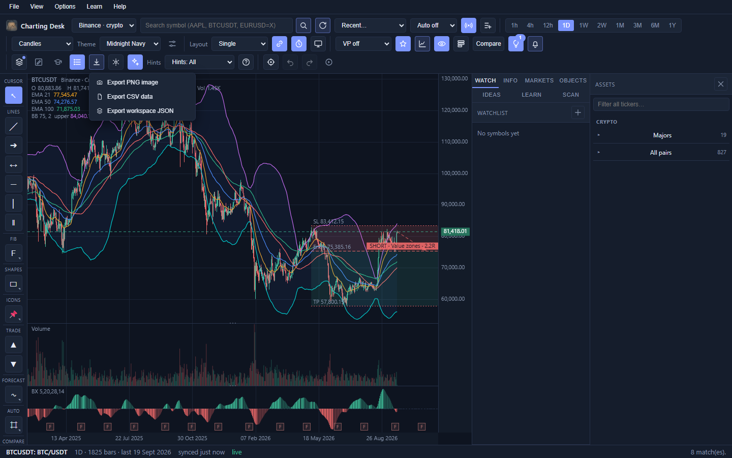
The toolbar Export button (and the File menu) offers three formats:
| Format | What you get | Use it for |
|---|---|---|
| PNG | A picture of the chart. | Sharing an idea, notes, screenshots. |
| CSV | Open, high, low, close and volume for the current symbol and timeframe, in ISO UTC. | Spreadsheets, your own analysis, record keeping. |
| JSON | The workspace definition. | Backups and moving setups between computers. |
There is also Import CSV. It reads a file of ISO or epoch OHLCV rows and adds them to the symbol's 1-hour or 1-day series, which is useful for testing data you already have.
Back to topThemes
Seven colour schemes ship with the app, three dark and four light. The Theme dropdown applies one instantly, and your choice is remembered.
- Dark: Midnight Navy, Heritage, Neon.
- Light: Solarized Light, Porcelain, Bauhaus, Executive.
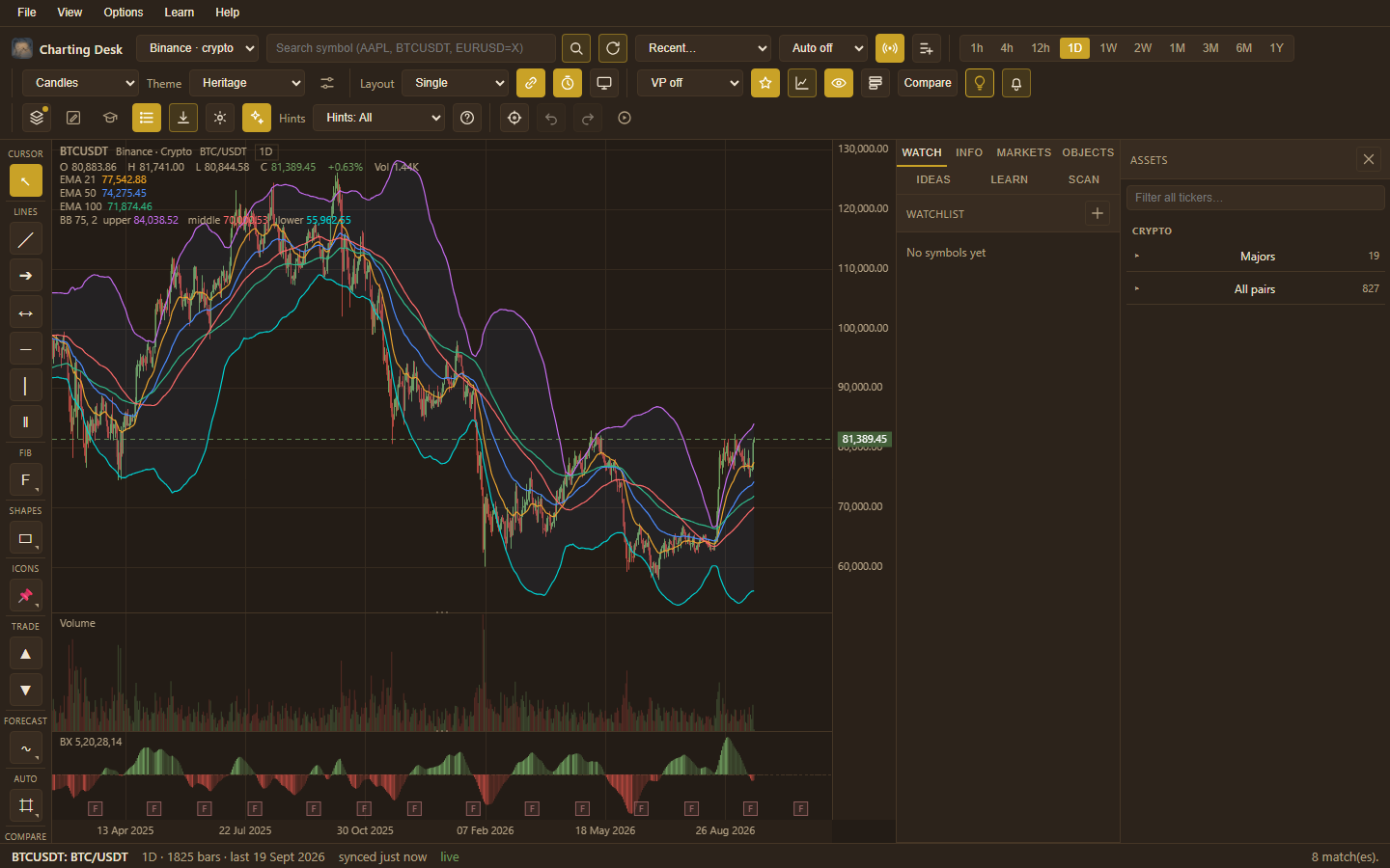
Preferences also let you set candle up and down colours, per-tool drawing colours, the number of price decimals, the default timeframe and gridlines.
Back to topHelp, hints and search shortcuts
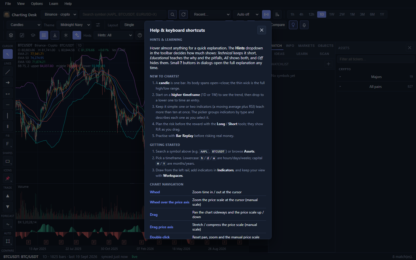
You are never expected to remember everything. The app explains itself in three ways.
- Hover hints. Hover (or keyboard-focus) almost any control and a tooltip appears after a short delay. Small ? buttons in dialogs open a fuller explanation.
- Hint level. The Hints dropdown in Advanced mode selects All (both lines), Technical (short), Educational (the why and the pitfalls), or Off.
- Help window. Press ? or F1, or click the ? in the toolbar, for the full keyboard reference and feature primer.
Guided walkthroughs
These put the pieces together in the order a real analysis usually happens. Follow along in the app.
1. Your first chart, properly read
- Load a symbol, for example
BTCUSDT. - Set the timeframe to 1D.
- Read the top-left legend: ticker, provider, asset, timeframe.
- Hover across the chart and watch the legend's O H L C and change percent update.
- Double-click to reset the view. You now know where everything is.
What you learn: the legend is your instrument panel. When lost, read it.
2. Build a watchlist as you research
- Search and load a symbol you care about.
- Click the toolbar star (or Options → Add to watchlist).
- Repeat for five or six symbols.
- Click between them in the Watch tab to compare their shape quickly.
What you learn: a watchlist turns idle curiosity into a repeatable routine. It also becomes a Scan universe later.
3. Read the trend with two studies
- Open Indicators and add EMA 50 and EMA 200 as overlays.
- Add RSI as a pane study.
- Ask: is price above or below each EMA? Are the EMAs stacked in order?
- Check where RSI sits: strong trends can hold above 70 for a long time, so treat it as context, not a buy or sell signal.
- Switch to 1W and repeat. Does the higher timeframe agree?
What you learn: trend is a relationship between price and averages, and the higher timeframe sets the context for the lower one.
4. Mark a level and get told when it is reached
- Pick the Horizontal tool (H) and click a price level you care about.
- Optional: double-click the line, rename it, and give it a distinct colour.
- Open the Objects tab and click the bell on that drawing row.
- Choose the condition, for example crosses above, and confirm.
- Leave the app open. When price reaches the level, a toast appears.
What you learn: alerts are one-shot on purpose. Once a level is hit, decide again rather than being spammed.
5. Plan a trade instead of just predicting one
- Find a setup you like and identify where you would be proven wrong. That is your stop.
- Pick the Long tool (S), click the entry, then the stop.
- Drag the take-profit line to a level you would actually exit at.
- Read the R:R. If it is below about 1.5, the idea may not be worth the risk.
- Save the view as a workspace so you can review it tomorrow.
What you learn: risk first, reward second. The tool makes that order unavoidable.
6. Compare two markets
- Load one symbol, for example
BTCUSDT. - Click Compare and search a second symbol, for example
ETHUSDT. - Read the overlay legend: the percent after each symbol is its move from the left edge.
- Pan and zoom, and watch the comparison re-base.
What you learn: relative strength. If the one you are watching lags its peer badly, that is useful information.
7. A top-down multi-timeframe view
- Set Layout to Two columns.
- Turn Link timeframes off so the two panes can differ.
- Load the same symbol in both panes.
- Set the left pane to 1W and the right to 1D.
- Only look for setups on the lower timeframe that agree with the higher timeframe's direction.
What you learn: alignment. Trading with the higher-timeframe flow is the classic beginner's edge.
8. Screen the whole market
- Open the sidebar Scan tab.
- Set the universe to Watchlist or All cached.
- Pick a pattern such as Breakout, and leave sensitivity at Medium.
- Click Run.
- Open an interesting section and read the evidence chips before clicking through to the chart.
What you learn: a screen is a shortlist to investigate, not a buy list. The chips tell you why each name appeared.
9. Practise with Bar Replay
- Load a chart and enter Replay.
- Click a bar well before the interesting part of history.
- Draw your levels and decide what you would do next.
- Step forward bar by bar and see the outcome. Be honest with yourself.
- Rewind and try again, or exit when done.
What you learn: how it actually feels to decide with uncertainty. It is far more useful than reading about a strategy.
10. Write your first custom indicator
- Open Indicators → Custom → New custom indicator.
- Name it "EMA spread" and choose placement Pane.
- Type
ema(close, 20) - ema(close, 50). - Click Add to chart and watch it cross zero when the fast average overtakes the slow one.
- Save the library to JSON so you keep it.
What you learn: the expression language turns a sentence of maths into a study, and custom studies behave exactly like built-ins.
Keyboard shortcuts
Shortcuts never fire while you are typing in a text box. Press ? for this list inside the app.
Tools
| Key | Tool |
|---|---|
| V | Select / pan |
| T | Trend line |
| H | Horizontal level |
| R | Ray |
| F | Fibonacci retracement |
| L | Vertical line |
| E | Extended line |
| N | Parallel channel |
| B | Rectangle |
| O | Ellipse |
| A | Arrow |
| Y | Text |
| Z | Zig-zag arrow |
| D | Doodle |
| I | Sticker |
| K | Marker |
| S | Long position |
| Shift+S | Short position |
| X | Fibonacci extension |
| G | Fibonacci fan |
| P | Andrews pitchfork |
| U | Measure |
| Q | Eraser |
| M | Toggle magnet |
Editing and navigation
| Key | Action |
|---|---|
| Ctrl+Z | Undo |
| Ctrl+Shift+Z / Ctrl+Y | Redo |
| Ctrl+C / Ctrl+V | Copy / paste drawings |
| Ctrl+D | Duplicate |
| Ctrl+A | Select all drawings |
| Del / Backspace | Delete selection |
| Esc | Cancel tool / drawing / selection |
| Right-click | Cancel drawing in progress |
| Ctrl+Shift+A | Toggle the Assets drawer |
| Ctrl+, | Open Preferences |
| ? / F1 | Open Help |
Settings reference
Most settings are toggles on the toolbar; the rest live in Preferences (Ctrl+,). Here is the whole map.
| Area | Settings |
|---|---|
| Symbol and data | Search, Sync, Recent symbols, Auto-refresh, Live, Add to watchlist. |
| Timeframe | The ten timeframe buttons. |
| Chart display | Chart type, Theme, Log scale, Percent scale, Invert scale, Session gaps, Session H/L, Value area, Crosshair, Pointer dot, Last price line, Event markers. |
| Panes | Layout, Link symbols, Link timeframes, Move to next monitor. |
| Analysis | Volume profile mode, Anchor, Favourites, Indicators, show/hide all indicators, Presets, Compare, Trading ideas, Alerts, drawing Template. |
| Layout and export | Workspaces, Board, Learn, Assets, Export, Preferences, Simple/Advanced, Hints, Help. |
| View and replay | Reset, Undo, Redo, Replay. |
| Preferences | Price decimals, Up and down candle colours, Default timeframe, On startup, Gridlines, Brick/box size, take-profit defaults, per-tool colours, reset buttons. |
Menu map
The menu bar mirrors the toolbar, which helps when you cannot find an icon.
| Menu | Items |
|---|---|
| File | Workspaces, Export PNG, Export CSV, Export workspace JSON, Import workspace JSON. |
| View | Panels (Assets, Watchlist, Info, Markets, Objects, Ideas), Panes (layouts, link toggles, move to monitor), Display (all scale and overlay toggles, grid), Chart (Blackboard, Replay), Theme. |
| Options | Add to watchlist, Indicators, Trading ideas, Alerts, Compare, Projection figures, Preferences, Reset drawing colours, Data (Flush cached data, Clear all drawings), Hints level. |
| Learn | Learn mode, Resume or start the course, Course home, Capture lesson skeleton (authoring). |
| Help | Help & shortcuts, About Charting Desk. |
Glossary
| Term | Meaning |
|---|---|
| Aggregation | Combining smaller bars into larger ones (for example four 1h bars into one 4h bar). |
| Alert | A watch on a price level, indicator line or drawing that notifies you when reached. |
| Anchor (drawing) | A handle point of a drawing, stored as a date and price. |
| ATR | Average True Range, a measure of how much price moves (volatility). |
| Bar / candle | One period of price data. Its body spans open to close; its wicks reach the high and low. |
| BOS / CHoCH | Break of structure and change of character, two kinds of structural break the Auto tool can mark. |
| Compare | Overlaying a second symbol, normalised to percent from the left edge. |
| Confluence | Several independent reasons pointing the same way (structure, level and momentum, for example). |
| Drawdown | The fall from a peak to a later low. Maximum drawdown is the worst one. |
| Drawing | Anything you place on the chart: a line, shape, Fibonacci, text or figure. |
| EMA / SMA | Moving averages. EMA weights recent prices more; SMA is the plain average. |
| Fibonacci | Levels derived from a move that price often reacts to, such as 0.618. |
| HTF | Higher timeframe, used as context for a lower timeframe. |
| Indicator / study | A calculation drawn from price, such as RSI or a moving average. |
| Instrument | The thing you are charting, identified by ticker, currency and asset class. |
| Live | Real-time updates on crypto charts, provisional until the bar closes. |
| Log scale | A price axis where equal vertical distance means equal percentage change. |
| Magnet | Snapping drawing points to a bar's open, high, low or close. |
| OHLC | Open, High, Low, Close: the four prices of a bar. |
| Overlay / pane / volume | Where a study draws: on price, in a panel below, or in the volume sub-pane. |
| POC | Point of control: the price with the most traded volume in a profile. |
| Preset | A saved chart setup (studies plus automatic layers) you can apply in one click. |
| Provider | The data source behind a symbol (for example Binance for crypto, or a cached Yahoo feed for US equities). |
| R / R:R | R is the entry-to-stop distance. R:R compares reward to risk. |
| Replay | Hiding the future and stepping bars forward to practise. |
| RSI | A 0 to 100 momentum gauge. Above 70 is often called overbought, below 30 oversold. |
| Scan | A screen over cached daily bars that shortlists symbols by pattern. |
| Session | A trading period (a day, or an exchange's hours). |
| Stale | Cached data that is old enough to be worth syncing. |
| Sticker | A small annotation glyph placed on the chart. |
| Sync | Fetching the latest bars for a chart. |
| Timeframe | How much time each bar covers (1h, 1D, 1W, and so on). |
| Value area / VAH / VAL | The price range containing about 70% of traded volume, with its upper (VAH) and lower (VAL) edges. |
| Value Zones | Shaded buy or sell pullback zones derived from the trend's last impulse leg. |
| VWAP | Volume-weighted average price, the market's average price for a period. |
| Workspace | A saved snapshot of a whole chart view. |
FAQ and troubleshooting
The chart is blank, or nothing loads
Check your connection, then click Sync. The first load of a new symbol always takes a moment. If a retry button appears with an error, click it. Data comes from public feeds that occasionally hiccup; trying again usually works.
Live shows "reconnecting"
Live streaming needs outbound access to Binance, which is blocked on some networks and in some regions. The chart still works; it simply falls back to normal syncing. Turn the Live toggle off if the status chip is distracting.
The last bar keeps changing
That is expected. The newest bar is not final until its period closes. A 1D bar keeps moving until the UTC day ends, and then it is written to the cache as a closed bar.
My drawings appeared on a different timeframe
Drawings belong to the symbol, not the timeframe, so a line on the daily chart shows on every timeframe. This keeps levels consistent. Delete it if you only wanted it on one timeframe.
I cannot draw anything
Three usual causes. A tool might not be armed (press the key or click the rail tool). The layer might be locked or hidden (check the Objects panel). Or you might be on the Blackboard with a tool that needs two clicks; press Esc and start again.
An alert never fired
Alerts are one-shot and evaluate after a sync and on each live crypto tick. Check that it is armed (the toolbar bell shows the count), that the condition and level are correct, and that it has not already triggered. Re-arm it if it did.
Why did the price scale stop following the price?
You switched to a manual scale by dragging or wheeling over the price axis. Double-click the chart, or press Reset, to return to auto-scaling.
The Scan finds nothing
The scanner reads only cached daily bars. If your cache is thin, load or sync the symbols you care about, or widen the universe and lower the sensitivity.
Where is my data stored?
In your own browser storage (IndexedDB). Your charts and settings are kept on your device. See Privacy, data and risk.
A symbol is missing
Crypto coverage is broad but not universal. Equity coverage is limited to US stocks, ETFs and forex. Try the Assets drawer, or a slightly different ticker format.
My custom indicator shows an error
The editor points to the line and column. The usual causes are a missing argument, an unknown function name, or a lowercase input where an uppercase one is expected. The "Inputs and functions" panel in the editor lists everything available.
How do I start over cleanly?
Options → Data → Flush cached data deletes stored bars and re-syncs, keeping your symbols, drawings and settings. Clear all drawings removes every drawing for every symbol. Both ask for confirmation first.
Back to topPrivacy, data and risk
Your data stays yours
- Charts, drawings, alerts and settings are stored locally, in your own browser storage (IndexedDB).
- No analytics or usage tracking. Your work is not studied or profiled.
- Exports are files you create and control.
Data sources
Crypto data comes from Binance. On the web, US stocks, ETFs and forex use a cached Yahoo feed with a free intraday source, in limited capacity. These are public, unofficial feeds. They can be delayed, incomplete or briefly unavailable, and they are not licensed market data. Charting Desk is an independent tool and is not affiliated with any exchange or data provider.
Not advice
Charting Desk is for research and education. Nothing in the app is investment advice, and no feature can predict the future. Trading ideas, Value Zones, scans and auto structure are suggestions you must judge for yourself. Past performance never guarantees future results.
Risk
Markets can move against you quickly. Never risk money you cannot afford to lose, and decide your risk before you enter, not after. The position tool exists to make that habit easy.
See the in-app About dialog for the live version and links to the full Disclaimer, Privacy and Terms pages published at chartingdesk.com.
Back to top
Charting Desk User Guide, for Beta 1 (1.0.0-beta.1). Screenshots are from the browser edition.
This guide describes the app as built; it is educational material, not financial advice.